Humans experience the world through their senses, leaving them keenly invested in the information delivered by sight, touch, sound, taste and smell. Marketing that engages multiple senses is proven to have greater impact – creating stronger emotions and lingering longer in our memories. Beyond memory, a study at Temple University showed that multi-sensory marketing sparks higher activity in the part of the brain involved in making purchase decisions.
Marketing to more than just the eyes should be a given for most campaigns, right? But it isn’t. This might be the case because a more involved campaign generally requires a bigger investment in planning, creativity, message targeting, time and budget. While these investments are often resisted, they can pay off big-time in ROI – as demonstrated by the campaigns featured in marketing-industry magazine INCITE.
Targeted to busy marketing professionals, the INCITE team puts these principles into play, creating attention-grabbing covers that stimulate the senses.
Sharing a chocolate bar
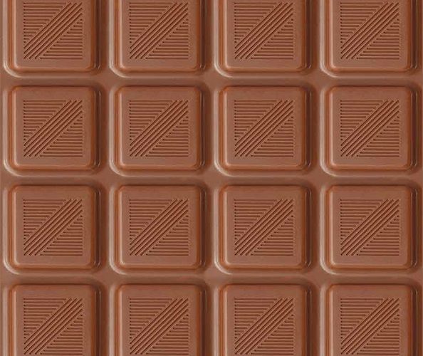
In an issue that highlighted an award-winning omnichannel campaign by chocolate company, Milka, the INCITE 4 cover played on the rich look and scent of chocolate. It featured a full cover image of a chocolate bar with two missing pieces. When recipients pulled out the magazine from its envelope – designed to look like a chocolate bar wrapper – it rubbed a bit, releasing the smell of chocolate from the cover. As readers flipped through the magazine, the subtle scent helped to anchor their reading experience more firmly in memory. It also acted as a reminder of the physical object, encouraging anyone in the same room to pick it up and leaf through it.
The crudeness of older scent-additive printing processes leaves many leery of using it. But advances in digital scent print technology create more subtle olfactory experiences. When it came to INCITE’s chocolate cover, the biggest challenge turned out to be human, not technological – everybody smells things differently. Kathleen Honey, Senior Copywriter at Publicis Hawkeye, explains, “As the scent-infused test pieces were reviewed by stakeholders at the agency and the client’s office, some found the smell of chocolate overwhelming, while others could barely make it out. It took a little extra time, but a decision that pleased most noses was finally reached.”
Tip
When producing a scented piece, test it on several noses and build in extra time for the “sniff test” process.
Animal crackers over Zoo biscuits campaign
The cover of INCITE 5 focused on a clever campaign to increase attendance at Cape Town’s Natural History Museum. The M&C Saatchi Abel agency leveraged South Africa’s iconic Zoo Biscuits with a “secret” dinosaur. It was only revealed after the recipient licked off a sugar coating on a cookie. The cookie arrived with an invitation to attend the museum’s new exhibit of African Dinosaurs the very next day.
INCITE’s team decided on a lenticular cover that reimagined the “revealing” aspect of the marketing campaign. This high-tech version of a flip-book prints a series of images onto plastic lens materials. By moving the print back and forth, new images and movement are revealed. Although the lenticular format can be used to show dimension or movement, the agency wanted this lenticular for a reveal. Jennifer McConville, Production Director at Publicis Hawkeye, was part of the team: “We provided the start and end stage, and the printer developed the intermediary stages. The approval process requires a small leap of faith, since the mock-up for approval gives you a sense of what it will look like, but it’s not as refined as the final piece.”
The lenticular cover somewhat increased print costs. But at a recent conference, it clearly accomplished its goal of garnering attention for INCITE and its contents. Attendees were picking up the magazine and moving it around to see the hidden image of the dinosaur. (One of the pluses of a lenticular is that it invites you to pick it up and interact with it.)
Marketing that roars (and sometimes gets petted)
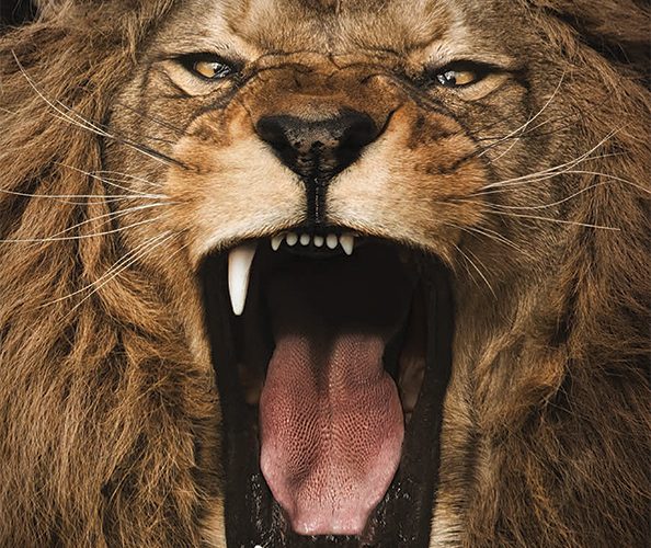
For INCITE 6, the creative team and client decided on a richly coloured, attention-grabbing visual of a lion’s roaring head, a reference to a Leo Burnett Thailand campaign. The client’s brief included the instruction that she wanted people to “pet INCITE’s cover.” This meant adding textures –a cost-effective way to increase the impact of printed marketing.
McConville describes the process of creating the cover: “We worked with the printer to determine the areas we wanted treatments on. To get the desired tactile qualities, we used a combination of inline and offline varnishes and ultraviolet (UV) coatings to create the final effect. UV provides a range of tactile experiences without adding too many processes to the print job. Fun fact: as we evaluated the proposed printings, we asked, ‘Will it be pettable?’ And it was. We’ve seen people holding the magazine and talking about it, unaware that they’re actually touching and stroking the cover!”
Tip
Some UV treatments make dark colours softer, while others make colours richer. Make sure that the client sees samples and understands that the colours may not be the same ones seen at the start of the process.


