Our brains are always on. What we see, hear, taste, feel and smell informs every decision we make.
Creative execution – that part of marketing that appeals to the senses – plays an important role in a campaign’s performance. Small nuances can have a big impact on your results, especially when it comes to direct mail. The physical nature and ability to appeal to all the senses make direct mail a powerful tool in your effort to garner attention.
So, what makes one piece of creative subjectively better than another? Researchers have been exploring that very question for some time – and what they have discovered may offer you a bit of a “cheat code” when it comes to increasing campaign results.
Learn from these success stories
In our latest webinar, Marketing Innovations: Inspiring success stories, Canada Post partnered with Diana Lucaci, a neuroscientist and CEO/co-founder of True Impact. The webinar explores some best-in-class examples to see how leading brands used research to rethink and reconfigure their original creative to drive results.
Discover more Marketing Innovations by watching the full webinar on demand
Watch nowFPM Solutions
LESSON 1: Focus on one key piece of information so that the message will be easily and quickly understood.
FPM Solutions, a Canadian medical device provider, wanted to use direct mail to drive shoppers into store locations or call to make an appointment. Analysis of the brand’s desired creative showed that reader attention was being drawn first to a facial expression within the main image, followed by the bold callout and finally a ‘now opening in Barrie’ announcement. None of those spots, however, were providing the reader the information necessary to visit a location or book a call.
Researchers from True Impact used the company’s trueSCAN technology to analyze the creative and recommend a little creative adjustment – swap out the first image for a new one of a person using a CPAP machine, reposition the phone number and play up the offer.
A follow-up analysis of the new creative showed a more intentional journey for the reader with attention first going to the image and product, then to the offer and finally to the phone number. The new design was successful by delivering the information readers needed to act while deemphasizing (or eliminating) any information unrelated to the brand’s objectives.

Original direct mail creative for FPM solutions.

Direct mail creative for FPM solutions after being optimized using trueSCAN from True Impact.
Little Caesars
Lesson 2: If everything is important nothing is important.
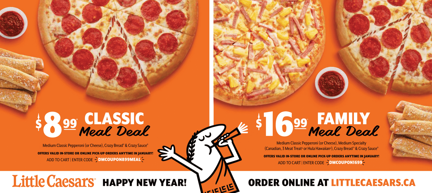
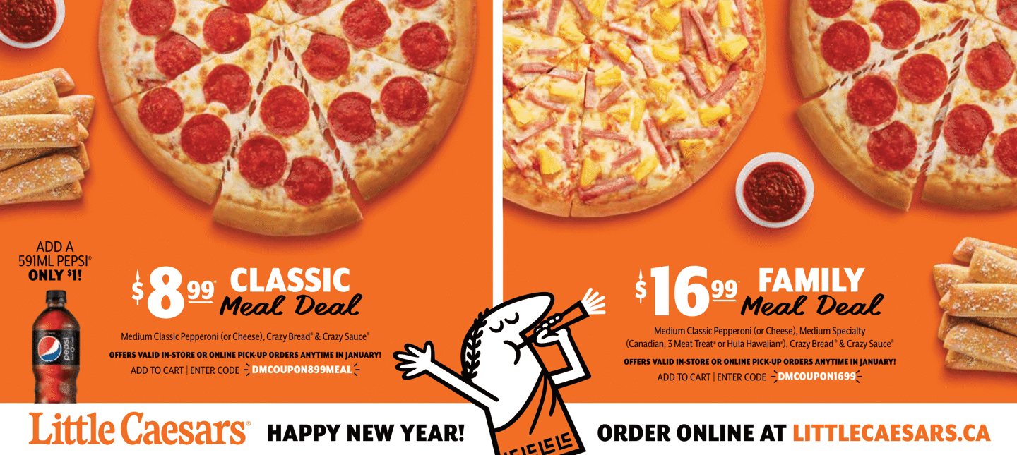
Little Caesars wanted to promote a pair of pizza deals. The direct mail creative they began with was rather busy and the order info was crushed by images. Again, trueSCAN analysis showed that reader attention was being drawn first to the main, oversized mascot image, then scattered attention moved to the numerous pictures of food. The offer and contact info were barely being considered.
Readers tend to disregard anything in a footer. Knowing that fact helped the pizza giant simplify its design and elevate its call to action. Those changes made the direct mail easier to read and access. Attention on the revised piece was drawn more intently on the offer and the call to action – exactly where they wanted it to go.

Original Little Caesars direct mail creative.

Little Caesars direct mail creative after being optimized using trueSCAN from True Impact.
Beneva Insurance
Lesson 3: It’s not about good design or bad design – it’s about design that fits an objective.
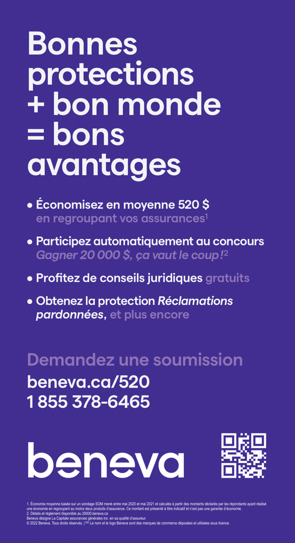
Beneva Insurance, one of Canada’s largest insurance providers, was promoting its 520 Campaign special offer. The analysis found that the company’s original direct mail creative was directing eyes to the right places, but the messages were confusing. Attention was going to the main title and URL call to action, but what readers found there wasn’t driving results.
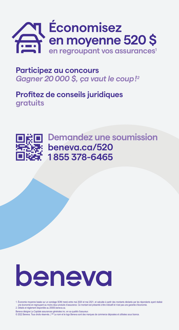
True Impact researchers recommended making a more direct mental connection between the offer and the title. By simply bringing the number “520” into the main title, the direct mail now clarified the offer for customers. The brand logo was not receiving enough attention in the first iteration, and it was corrected in the second one. Additionally, bringing the QR code closer to the call to action provided readers with plenty of opportunities to interact.

Original Beneva Insurance direct mail creative. (Advertising available only in French)

Beneva Insurance direct mail creative after being optimized using trueSCAN from True Impact. (Advertising available only in French)
Explore more possibilities for your business
These three brands refused to leave their creative execution to guesswork. Instead, they used sound scientific principles to elevate their direct mail design and found success without much additional effort or expense. These same principles can work for you and your next direct mail campaign.
The Marketing Innovations webinar offers more examples and expertise from Lucaci, plus a first-hand account of the possibilities of combining research insights with direct mail creative from Marc-Alain Guilbert, former VP of Growth Marketing and Customer Experience for Goodfood. To learn more, watch the webinar on demand now.
Already watched the webinar? Learn more with The Essential Guide to Direct Mail.
Take your creative to the next level with our guide that examines the keys to successful direct mail campaigns.
Get the guide