George Christidis is Vice President, Key Accounts at St. Joseph Communications (SJC), a recognized leader in the North American commercial print sector. The company works with ambitious brands to tell their most defining stories – producing and distributing over 200 million catalogues and magazines, plus one billion flyers a year.
We talked with George about his passion for the printed page, and we immediately agree that the way consumers engage with brands has changed dramatically. From digital, social, experiential and mobile to retail, print and digital signage.
Integrated marketing
In an omni-channel marketing environment, successful brands embrace this new way of thinking. They engage their customers through emotional connections and seamless experiences that produce consistent, actionable content across multiple platforms and devices.
Brand storytellers
At SJC, there’s nothing traditional about catalogues.
These days, brand storytelling is big, and it’s reflected in the new age of catalogues, magalogues, look books and gift guides that this leading media company creates for Canada’s biggest brands. A look inside the SJC portfolio reveals names like Walmart Canada, Leon’s, The Brick and Alphabroder.
9 tips from a seasoned cataloger
So what advice does George have for anyone who wants to create excitement and drive sales by bringing their brand to the printed page?
1. Involve stakeholders from the start
George tells us, “To anyone thinking about creating a catalogue, I always say to gather people with interest or input right from the get-go. It’s the only way to ensure that everyone’s point of view is reflected in the catalogue storyline. A way of getting everyone thinking ahead about how they will leverage the catalogue and its content when it’s distributed.” Depending on the complexity of your catalogue, this means consulting stakeholders about 4-6 months before a catalogue will be in the hands of the consumer.
Think ahead
Round up product developers, trend directors, buyers, marketers, creatives, digital teams, merchandisers and in-store experts to get them thinking about what they’ll need to see in the catalogue when it comes out. And, where you lack the internal expertise, fill the gaps with online research and third-party knowledge. Allocating time and effort at this stage will give you the information you need to capture all your visual content efficiently and cost-effectively – at the point you’re in full production mode. SJC’s unique approach – create once, publish everywhere (C.O.P.E) – ensures brand-consistent content across all platforms, as well as creating time and cost efficiencies.
2. Define your objectives
Agreeing on goals and objectives means that everyone is focused on catalogue outcomes. Are you:
- Acquiring new customers?
- Driving shoppers online or in-store?
- Cultivating loyalty?
- Increasing wallet share?
3. Determine the demographic
The catalogue experience has changed, so it’s very important to consider the demographic you’re targeting. Who’s going to be engaging with this catalogue? Boomers will not view it the same way as millennials. In the past, catalogues contained multiple items, because merchants sold directly from the page. Now it’s possible to find products in other ways – online, through social media, in-store.
Solutions on the page
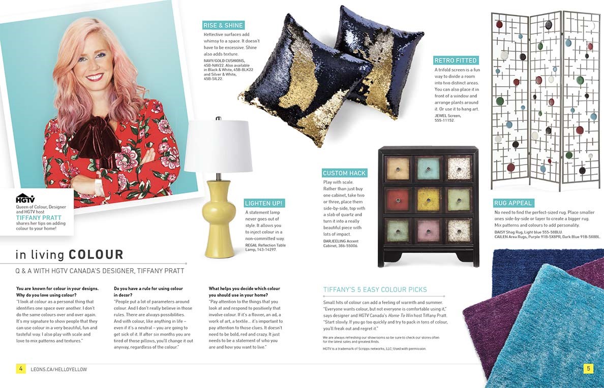
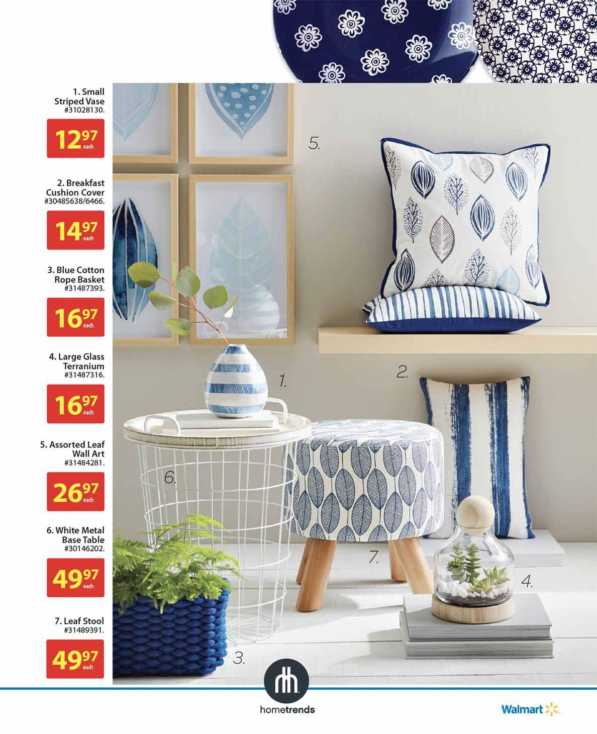
How-to advice and tips play out well. George tells us, “Millennials don’t have the patience to wade through mounds of content. They’re time-strapped, and they like solution-oriented information. They’d prefer to see a room set that pairs a table with a lamp, pillows with a sofa, flooring with a rug. It’s a show-me-how-and-I-will-do-it approach.”

Image courtesy of St. Joseph Communications
4. Tune into what’s trending
By thinking ahead, you’ll be able to develop catalogue layouts that give maximum exposure to the top-selling products and collections that buyers have purchased in large volumes because they’ve anticipated trends. Once you know your hero pieces, you’ll be able to plan where to place your feature items and which spreads will benefit from associated video content, what approach you’re going to take on social media or how your in-store signage needs to look.

Image courtesy of St. Joseph Communications
5. Breathe the brand
The success of your catalogue depends on the strength of your brand. Customers should recognize it immediately. Catalogues are a great place to communicate strong brand identity – away from the digital clutter.
This goes beyond being faithful to corporate colour palettes. The overall look and tone has to be representative of your brand personas, your values and the lifestyles of the shoppers you’re targeting.
Forward facing
Now you can overlay the trends you’ve identified. Again, that doesn’t just mean colour trends (although colour accuracy is critical when making purchases from a paper-based medium). You’ll also need to make sure patterns, logos, fonts, design and layout all reflect the upcoming season’s styles. This catalogue needs to be right on trend when it hits the market.
6. Create channel-specific content
While the visual content of your catalogue is being captured, assemble a team of writers and editors. George recommends creating a pool of information – bullet points will do as a start – relating to product specifications, features and benefits. From there you can write channel-specific content based on the best practices for each medium. While you might use only 3 bullets on the printed page, to create interest, you’d be able to expand that content online (say 10 bullets) to amplify the information.

Image courtesy of St. Joseph Communications
7. Develop key spreads
Current best practice is to design in spreads rather than pages. By using a large image that crosses pages, you’re extending the story. Giving readers a reason to linger. Cover shots are often the big sellers, and your catalogue can end up either way in the mailbox. Your front and back covers need to grab equal attention.
Glanceable design
Not just for digital, this creative approach is relevant on the page too. Nowadays, you’re more likely to see 4 items on a spread, rather than 12 products that are surrounded by dense copy. George points out that old-school thinking went something like this, “The more I can put on a page, the more I can sell.” Nowadays, people expect to be engaged within the first three seconds of eyeing the spread. The less there is on a page, the better, because shoppers will notice and dwell on it for longer.
“George adds, “The goal is to inspire and have them visit online or in-store. If you lose them on the page, you’ve lost them elsewhere.”
8. Learn from social media
Think about the most current digital channels – spaces like Instagram and Facebook. Influencers rule these environments – real people advising their peers. St. Joseph Communications encourages clients to incorporate the same philosophy into the printed page. Become a trusted advisor rather than a product promoter.
9. Be lifestyle-sensitive
Today’s customer isn’t as price sensitive as previous generations of catalogue shoppers. Instead, the question will be, “Does this fit with my lifestyle?” Focus on creating an inspirational setting that resonates with the aspirational goals of your audience. If someone can place their lifestyle somewhere on that page, they’ll identify with your brand. According to George, only then does price come into play.
If you’d like to learn more about catalogues as part of the modern marketing mix, take a look at some of the other posts in the series:
- Toronto Fashion Week: From pixel to page – why print catalogues are the new Instagram
- Amazon goes analog: 6 reasons why the print catalogue revival is good for your business
- The print media revival. Lessons from IKEA, Canadian Tire and Facebook
- Mini-catalogue, lookbook or gift guide? How to pick the best format for direct mail

