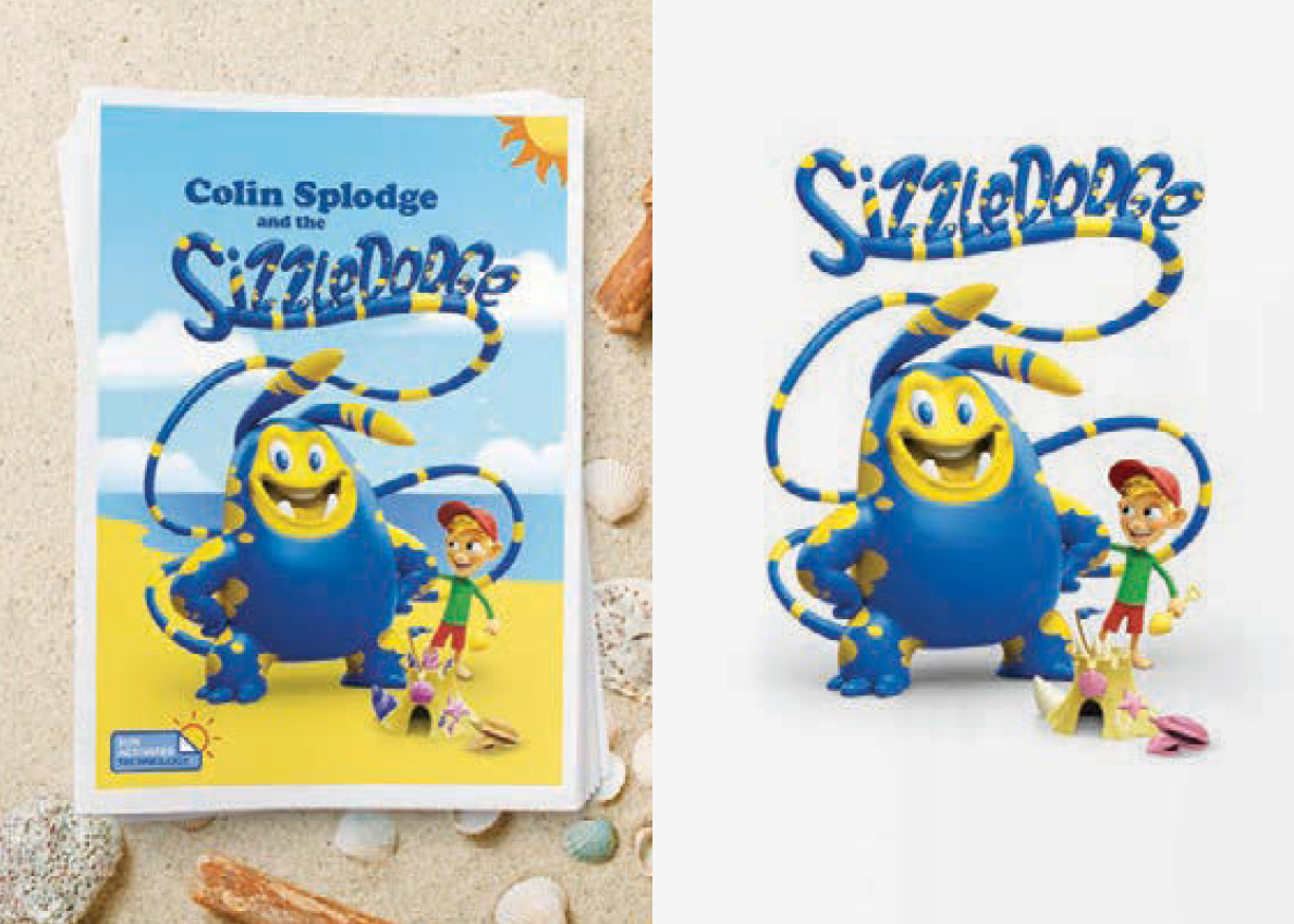
A good design concept, functionality, and a little print technology innovation can fuel an unforgettable direct mail campaign. In the latest issue of INCITE, we look at a unique direct mail piece from J. Walter Thompson for Banana Boat Sunscreen. By using a unique medium and cutting-edge ink, the company sent an important message about sun safety that people actually paid attention to – and came back to again and again.
The problem
Sun safety is incredibly important for good health – especially in Australia, which has some of the highest UV radiation levels in the world. Despite UV rays being such a big problem, many Australians don’t maintain a good sun safety routine.
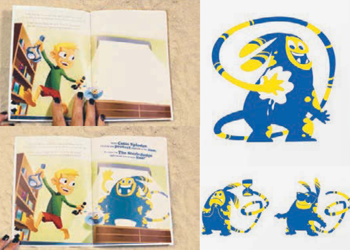
To change that, Banana Boat Sunscreen created an educational campaign to make sun safety fun for parents and children. They designed a cute book for kids called Colin Splodge and the Sizzledodge. It was the world’s first sun-activated kids’ book and was written in UV-activated ink! The story follows a little boy who loves being outside, and a strange creature that wants to help him dodge the sizzle.
The innovation
Wondering why UV-activated ink was used in the book? The cutting-edge ink was chosen so that the Sizzledodge character would only appear when the pages were exposed to the sun, signalling to the kids reading that they needed to apply their sunscreen.
The hope was that the book would be a fun tool that children and parents would enjoy reading over and over again. Families would tote it to places like the beach routinely, where the book acted as a UV alarm – telling kids and parents when it was time to cover up and apply sunblock.
The outcome
The campaign was well received by Australian families. It had a bit of a magical quality thanks to the disappearing and reappearing ink. It was widely distributed through a popular Australian website for women, the Australian school system, and promoted by influencers and ambassadors.
Why it worked so well
By creating a distinctive, durable, engaging and fun marketing piece, the campaign’s message resonated for years after it was launched. It made a strong impression and provided great value to recipients. Here’s what marketers should take away from this case study:
#1 Do what you can to stand out
While a cute book on its own would likely have made an impact, the ink played a big part in this campaign’s success. These days there is so much information bombarding people that being different and unique is more than just a great thing in marketing, it’s essential. Don’t just follow the pack. Be brave, try new things and stand out – or risk going under the radar.
#2 Lighten up
Part of the genius of this campaign was its tone. It took a heavy issue and provided a fun and accessible solution. No one likes a lecture, but people love to learn if your message is delivered in a fun or attention-grabbing way.
#3 Make your marketing piece functional
One of the best things about this direct mail piece was that it was useful for recipients. It was a tool that could be used again and again. When your marketing incorporates functionality, your recipients potentially become your ambassadors.
Make your next direct mail campaign stand out by experimenting with your medium. There’s innovative print technology, or you can make your marketing piece functional. Being different, fun, and practical is a great way to engage your customers and it can even generate free advertising for your company.

